RU Connected
An app designed for the well-being of students at Rutgers University to stay connected in a post-pandemic society
My Roles & Responsibilities
Problem Statement, User Research Data Collection, Data Analysis, Design Thinking, Ideation, UI Design, Wireframing, Prototyping, User Testing, Heuristic Evaluation
Context
Group class project under design mentors Ronnie Battista, David B. Ogunrinde, Lisa Woodley, & Tobias Komischke
Team Members: Gopi Kachhia, Zainab Abbas, Nandani Patidar, & Pavithra Navamani
(Spring 2022)
%20(5).png)
Tools
Figma, Balsamiq, Miro
Project Overview
Covid has deeply impacted the mental health of college students, and many are still struggling to adjust back to the in-person college lifestyle. In this new normal, Rutgers is helping both new and returning students to enjoy the process of returning to campus and help them get used to the in-person environment again.
PROBLEM
-
The COVID-19 pandemic created an absence sense of community for members of the Rutgers community
-
The in-person transition back to campus was disorganized, and students didn't know where to find information to suit their needs.
ROLE
UX/UI Designer
TASK
Design new social features for RU Connected
GOAL
Design an app for Rutgers students to access information on in-person campus events, transportation services, and other important resources to create a supportive sense of community for members of the Rutgers community
DATA COLLECTION & ANALYSIS
📝 Research
In the first step of user research, our team decided to interview both Rutgers undergraduate and graduate students. Throughout this process, we obtained both qualitative data (user interviews) and quantitative data (user surveys).
1. Survey
We first created a survey to get the statistical and factual data to narrow our focus. The survey was sent to both graduate and undergraduate students and got a total of 21 responses.
72% of the respondents are between 22 — and 24 years old.
67% are graduate students, and 22% are undergraduate students.
89% of the respondents are living off-campus.
61% of the students commute by car to the campus.
70% like to attend community events/meetings.
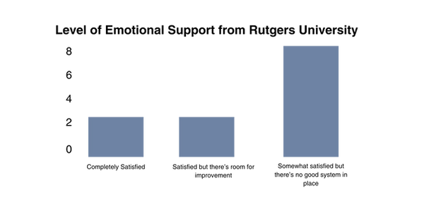
50% of the students feel Rutgers supports them emotionally, and their strategies work somewhat, but there’s room for improvement.
56% of the students feel there is a strong sense of community at Rutgers, but there’s only very little cross-support between faculty and students.
%20(1).png)
.png)
Survey Results
2. User Interviews
Once our team collected and analyzed the quantitative data from the surveys, we interviewed 4 students to get a better understanding of their own individual experiences at Rutgers, specifically their feelings about being on campus, including their wants and needs.
➡️ From the interviews, we found a few key quotes interesting and want to address:
User 1
“I think Rutgers has many resources to support students. However, there is a lack of awareness among students. It’s hard to follow what’s going on on campus that I can benefit from. “
User 3
“It’s been hard adjusting to life on campus regarding in-person classes."
"No, I don’t feel supported, especially when emailing professors currently teaching online.”
User 4
“Yes! Allow me to park anywhere on campus. It’s so hard. I commute for 20 minutes, but some students commute for like 40 minutes and drive here.”
Insights from User Interviews:
Students prefer in-person events.
They prefer hybrid classes in the new normal.
Students want to be allowed to park in multiple locations on campus.
Students want information on what’s going on on campus.
IDEATION
👩🏻👦🏻 Creating Personas
After completing the user interviews, our team was surprised to see the stark difference between undergraduate and graduate students. Therefore, we decided to create two personas for our final product.
She's frustrated with the lack of information on in-person campus activities
➡️ The first persona our team created is Heather, a 1st-year graduate student who works part-time from home. She's an extrovert and loves attending in-person events. She also shares a car with her roommate to get around the campus.

The two graduate students that we interviewed expressed similar pain points and goals. Both of them are mostly occupied by academics but want to find time to attend campus activities. The main issue we found is the lack of information not given to Rutgers graduate students.
➡️ The second persona our team created is Alex, a full-time Pre-Med undergraduate sophomore living near campus who commutes to school daily. He's shy and introverted but wants to connect with people at campus events. He struggles to adjust from a "high school set schedule" to a "flexible college schedule."
He also struggles to find time to eat/rest/study in- between his classes.

The students that represent Alex are mostly undergrads who commute to school daily. These students were doing school remotely in their own homes, and many of them struggled to transition to campus life while balancing their academics and sticking to a daily schedule.
📜 Journey Map
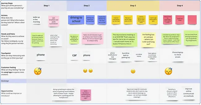
Creating the journey maps for our two users allowed us to explore and consider the actions, needs, and feelings of students in order to identify potential areas to fix and improve that students face on a daily basis. By understanding their point of view, we were able to brainstorm and choose what features were best for the app.
📝 Design Studio
Before creating our wireframes and final prototype, our mentors instructed everyone to create their own individual sketches through the "Crazy 8" design sprint. Through this fast-sketching exercise, we had 8 minutes to complete 8 distinct ideas.
The process was initially intimidating, but our mentors assured us that these are rough sketches, the goal is to communicate ideas with our team, and the time restraint is to help us channel our creative impulses.

After sharing our sketches with each of our team members, we discovered that some of our ideas were different and even impractical. But we've discovered one thing that we all want to implement in our app:
NAVIGATION
Overall, this exercise helped our team discuss several transportation issues that many Rutgers students face on a daily basis, and finalize the main features to solve this issue.
PROTOTYPE & TEST
📱 Wireframe/Mid-fidelity Prototype
Our team created a medium-fidelity prototype on Balsamiq. The primary focus of the prototyping stage was functionality and information architecture. After evaluating our user research, personas, journey map, and design studio, we finalized the app to have 4 main pages: Event, Map, Park, My Events.
Event Features

Profile picture leads to user settings
Users can find and explore events they want to attend and RSVP
Map

Students can search their desired location
Students can select a specific category to find their desired location easier
This will guide students from the starting point to the destination
Students can see the number of available spots

Parking
Students can search which parking spots are available

My Events
Event Details + Event Chat


Campus/Bus Location
Profile
Rutgers has a diverse student body, and language options are needed

Students can filled out their contact information
Food

Building


Bus Information
Direction Example From Point A to Point B
This map is presented in an AR view


✍️ Geurilla Usability Testing
We did usability testing on a small sample size of people to get a sense of what was working and what changes needed to be made to our prototype. The testing was very insightful to our design process because it revealed many shortcomings in the design and information architecture that can be improved upon in future iterations.
Heuristic Evaluation
The final step of our project was to conduct a heuristic evaluation of our designs to find errors and make future improvements.
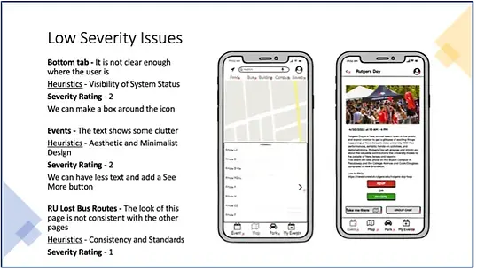
As a team, we reviewed our prototype and assigned severity ratings to each heuristic issue.
We categorized our issues into low severity, (rating of 1 & 2), and high severity issues (rating of 3 & 4) Our top issues were consistency + standards and visibility of system status.
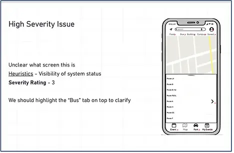
Many users felt the events and my events feature had the same icon and some didn’t understand the purpose of certain screens. This is one of the main issues we found out from our own team evaluation and assigned a severity rating of 3.
Insights from user testing and heuristic evaluation:
From the user testing and heuristic evaluation, the product needs to improve in the following areas:
-
All the users had difficulty using and navigating the map feature.
-
Highlight the tab of the page that we are on since certain screens lack visibility of system status, i.e., we can’t tell what screen we’re on.
-
The events page should add a “Are you sure” dialogue popup to prevent the users from registering for the wrong event.
What went well
-
The design studio, where we brainstormed and ended up with our final product, went well because we could design and critique our ideas, so we knew what to focus on.
-
Some of our product’s features were highly regarded by students. For instance, the events features allow them to add themselves to the event’s group chat and display all their registered events in one place.
What could have been done better
While focusing on students’ daily challenges, we neglected to address the faculty’s concerns in this new normal. We could not adequately capture the faculty audience in our survey; therefore, we focused solely on the students.
📱 High-fidelity Prototype
To visualize how RU Connected could be used in real life, I took the mid-fidelity prototype a step further and transformed it into a high- fidelity prototype on Figma.
.png)


💭 Takeaways
& Next Steps
The complete process of resolving the problem through a design solution within two weeks was hectic , but what we learned was to pay full attention more on the users and enhance their experience. In addition, the agile technique for working on an issue was beneficial since we could test our process at each stage with users, allowing us to produce a product that the people wanted rather than simply for us.
Here’s what went well and what we could have done better:
1. RE-TEST
Now that I made revisions to my design and added the visual elements, I would like to test and validate the changes made and observe if any further improvements need to be prioritized.
2. DESIGN HANDOFF
With a finalized version of the design, I would then present the final design to stakeholders and hand it off to developers to build the app
.png)
