Care+
Designing a solution to help women track their own period journey and form a community with Care+ users
My Responsibilities
Context
Problem Statement, Data Collection, Data Analysis, Ideation, Research, UI Design, Testing, Wireframing, Prototyping, Heuristic Evaluation, Geurilla Usability Testing
Individual semester class project under Prof. Sunyoung Kim
(Sept 2022 - Dec 2022)
%20(1).png)
Tools
Figma, Procreate, Miro, Canva
Project Overview
THE PROBLEM
ROLE
UX/ UI Designer
TASK
Design a new period app integrating social features to connect with Care+ users
THE GOAL
Design a period app for women to track, share, and learn about their period journey
-
Many women do not have a support system to learn, understand, and confide in their period issues.
-
Period stigma, loneliness, and lack of period education are common problems that are not properly addressed.
DATA COLLECTION & ANALYSIS
📝 Sample Interview Questions
In the first step of collecting data, I brainstormed different questions before interviewing the participants. I crafted around 20 questions, and the main topics are productivity, health/wellness, and relationships. Here are some sample questions:
Relationships
-
How do other people react when they know you have your period?
-
What do you think your relationships would look like if you never had periods?
-
How often do you talk about your period issues to your friends/family members?
Health/Wellness
-
Has your menstrual/period cycle changed throughout the years?
-
Are there methods you use to relieve and decrease period pain?
-
How often do you exercise while you have your period?
-
Does your diet change while you have your period?
Productivity
-
Are you usually able to get your daily work done while having your period?
-
Does your period change your daily routine?
📝 Survey
Next, I created a list of survey questions to collect data from a large pool of people. I crafted 20 questions, and instead of sending the survey to the same 3 young women I interviewed, I sent it to 12 different women in different age groups. Here are some sample survey questions + results.
.png)
Survey Summary
-
12 people completed the survey
-
20 questions provided
-
Baby Boomer and Gen X women have more conservative views regarding period issues
-
Millennial and Gen Z women are more open to using a period app
Default Report Summary
-
12 people completed the survey
-
20 questions provided
-
Mixed results were the most surprising
-
Each individual has different needs and perspectives on menstruation
🗂️ Affinity Diagram
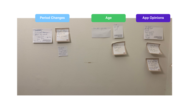
Next, I revisited the questions I asked my housemates, and extracted meaningful information from my interviews, and sorted them into 3 groups (Each group is from each housemate).
.png)
After, I divided the 3 groups into 6 categories (Productivity, Period Effects, Treatment, Period Changes, Age, App Opinions)
Affinity Diagram Summary
While sorting out the post-it notes, it was interesting to see the similarities and differences of the three housemates I interviewed. The sorting process gave me a better perspective of menstruation.
IDEATION
👩🏻 Creating Personas
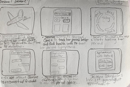
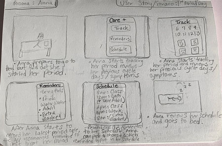
After gathering data, I had a better idea of who the target audience could be for potential Care+ users. I created personas of 2 young women, one who's a student, and another with a full-time job.


📝 Storyboarding
After creating the personas, I created the storyboards to illustrate how both women might use a period app in different scenarios.
PROTOTYPE & TEST
🖊️ Lo-Fi Wireframe Sketches
At this point, I started sketching different ideas for the layout of the app. Throughout creating the low-fidelity wireframes, I initially had the idea of splitting the app into 4 pages: Chat, Calendar, Track, and Reminder


🖊️ Mid- Fidelity Wireframes
Taking the lo-fi wireframe sketches, I digitized them and added just enough information for users to be able to navigate through the pages and complete tasks I would present to them during usability testing.
.png)
📃 Flowchart
Next, I created a flowchart of the wireframes to visualize how the user could potentially use the app.
.png)
👆 Heuristic Evaluation
Before creating the prototypes, the professor assigned the students to perform heuristic evaluation on our low-fidelity wireframes and assign a severity rating from a scale of 0-5 (0 is no error and 5 is a severe error) and give possible suggestions for our apps.
-
I love the look of this app, it is very consistent in how it executes tasks (0)
-
Minor changes such as adding more names and buttons to be more specific (2)
-
The doctor feature was very confusing (5)
-
The "Appointments" page does not allow users to cancel appointments (3)
-
Can users just speak with their own family doctors? (5)
-
How verified are these doctors? (5)
📱 Hi-fi Prototyping
After reviewing the heuristic evaluation, I made changes to the final prototype and ultimately finalized the app to have 5 major pages: Home, Community, Track, Calendar, and Reminder
Homepage
.png)
Users can invite friends to use Care+
Users can see their friend's period calendar
Profile picture leads to user settings
Users can view the recommended content that the Care+ community has chosen to help women educate themselves on period related topics
Community
.png)
Track Detailed Features
.png)
Users can input their period information each cycle
Dark pink dot indicates which day the users input their period information
Light pink dot indicates which days the users have their period
.png)
Users can input their period information each cycle
User's Personal Period Calendar
The app notfies the users when is the next predicted period cycle
.png)
Reminder Features
Users can put information to remind themselves what to do during their period cycle
Users can set up a reminder notification whenver their period start
.png)
.png)
App Login + Sign In
User Settings + Invite Friends Feature
.png)
.png)
.png)
.png)
.png)
Friend's Personal Period Calendar
.png)
.png)
.png)
.png)
User's Period Information
.png)
.png)
.png)
.png)
.png)
.png)
Podcast
Video
.png)
.png)
Care+ News
✍️ Geurrilla Usability Testing
Finally, I conducted guerrilla usability testing on 4 participants, and each of them tested out the final prototype and pointed out any errors that they found.
PARTICIPANT #1
.png)
Visual Errors:
-
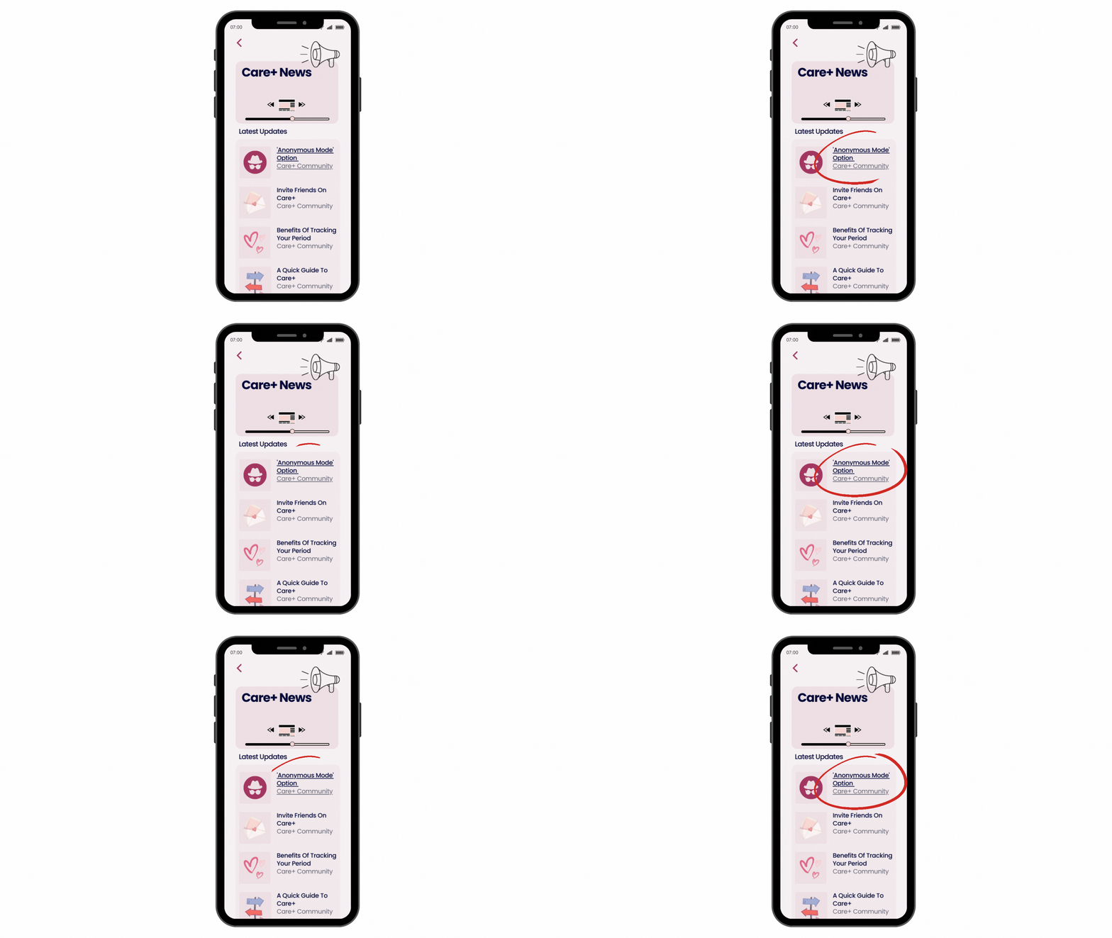
The first participant found a minor error displayed on the community page (Care+ News). She found that the article titled, “'Anonymous Mode' Option’” is underlined while the other news articles are not.
PARTICIPANT #2
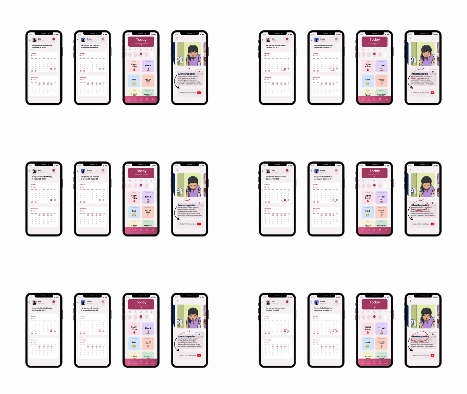
Technical Errors:
-
2 of the user's calendar dates link to the track page (main user’s track page) If this was a real app, the users could be perplexed about why their friend’s calendar page links to the main user’s track page.
-
The YouTube channel link was provided in the title called “Menstrupedia” instead of the tab that says “Watch On YouTube.”
.png)
PARTICIPANT #3
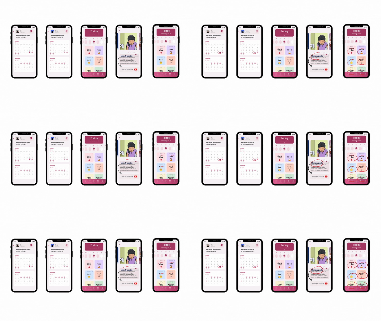
Technical Errors:
-
Found the same technical errors the 2nd participant found (the link between the friend’s period calendar and the main user’s calendar on the track page + the wrong YouTube link placement)
Personal Changes:
-
Found the same technical errors the 2nd participant found (the link between the friend’s period calendar and the main user’s calendar on the track page + the wrong YouTube link placement.

PARTICIPANT #4
Visual Errors
-
Three dots on the reminder page are unnecessary.
-
Some calendar dates are mixed up (the track page, predicts that the main user’s period will start on Nov 30, 2022, but the calendar page, shows that my next period will likely start on Nov 29, 2022).
-
The homepage shows today's date as Wed, Nov 28 but on the track page, it’s Wednesday, Oct 28.
Personal Changes
-
Settings feature (when you click on the user’s profile picture in the homepage top right) the participant pointed out that there’s no need for a “switch account” feature for this app.


💭 Takeaways & Next Steps
I faced new challenges during this project that I hadn’t faced before - seamlessly integrating a new feature into an existing design and designing for a mobile application that I wasn’t entirely familiar with.
Through this project, I got to think about how to make Care+ a better experience for women to use.
The next steps I would take this project through from here are:
1. RE-TEST
To validate the revisions made, I would conduct another round of testing with users.
2. ADD FEATURES
After the retest, I would observe how people are using it and work on updating priorities and adding new features to the app.
.png)
.png)

.png)


